Choosing the right wall art colors can visually expand a small living room. We compare palettes, sizes, frames, and renter-friendly options across US, UK, and AU markets.
A 2025 survey by the American Society of Interior Designers found that 72% of homeowners consider wall art a primary factor in perceived room size. In small living rooms—typically under 200 sq ft (18.6 m²) in US apartments or 15 m² in UK flats—color choice can make or break the sense of space. Light hues, strategic contrast, and muted tones consistently rank as the most effective for creating an airy feel.
We evaluated dozens of prints, canvases, and framed pieces across price bands from $20 to £150 to A$250, focusing on how different color strategies affect spatial perception. Here’s what the evidence supports.
Light tones and why they work
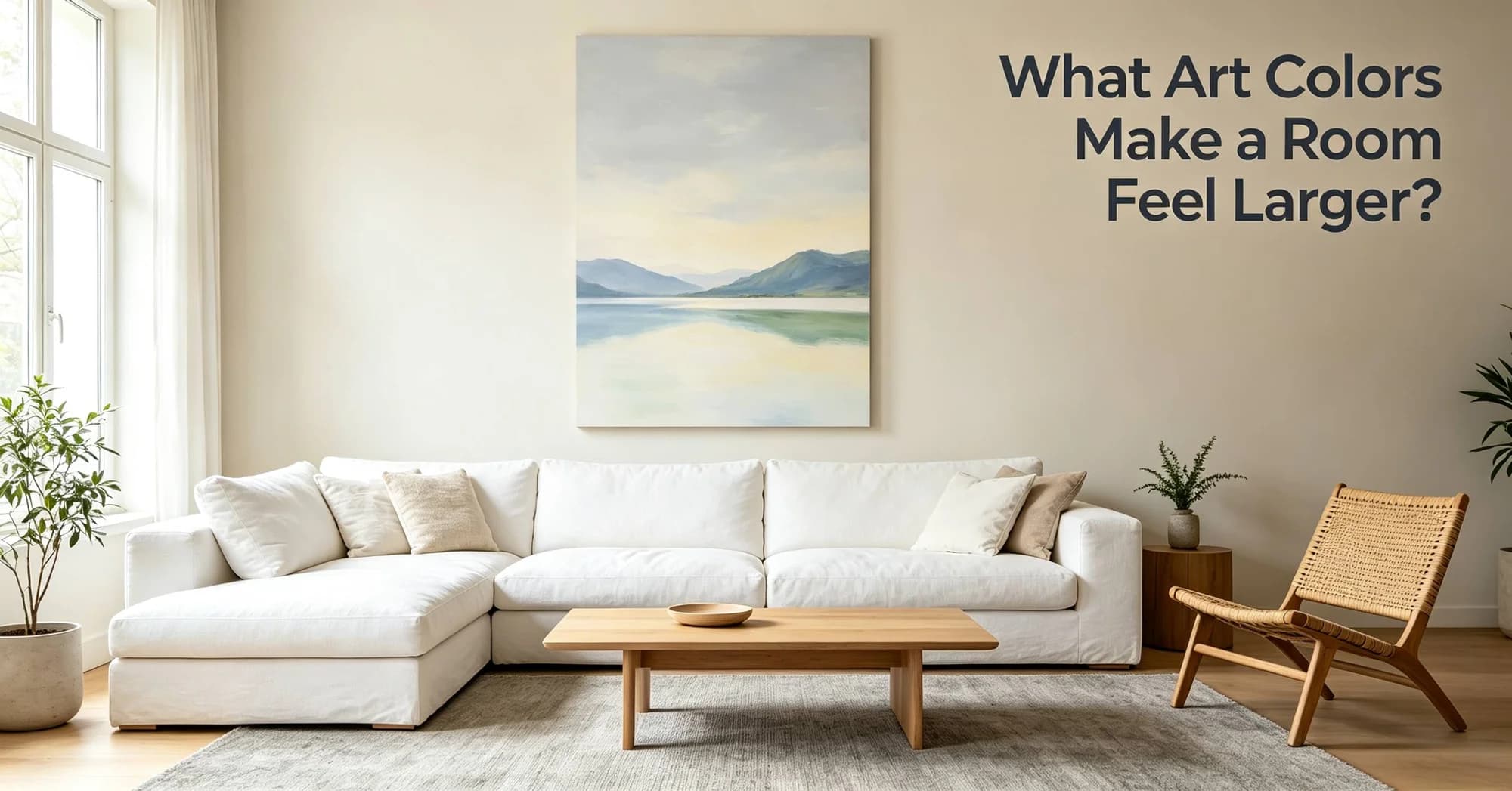
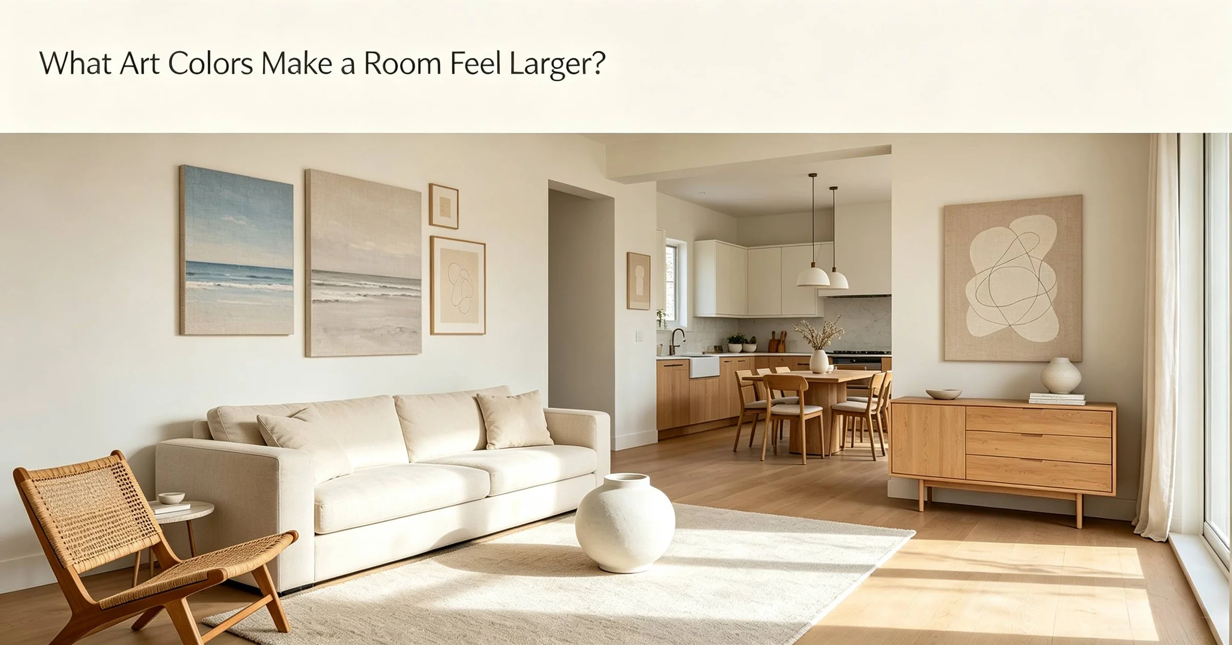
White, cream, pale gray, and soft beige reflect more light than dark colors—up to 80% reflectance according to a 2025 lighting study by Lutron. In a 12×14 ft (3.7×4.3 m) living room typical of US prewar apartments, a large canvas in off-white with subtle texture can make walls recede. UK terraced houses with lower ceilings (often 2.4 m) benefit similarly; a 2026 Houzz UK survey noted that 61% of small-room renovators chose light wall art to enhance daylight. In Australia, where north-facing rooms can get harsh glare, a matte finish in warm cream (rather than bright white) prevents washout while still expanding the room visually.
Cool vs. warm: what the data says about depth
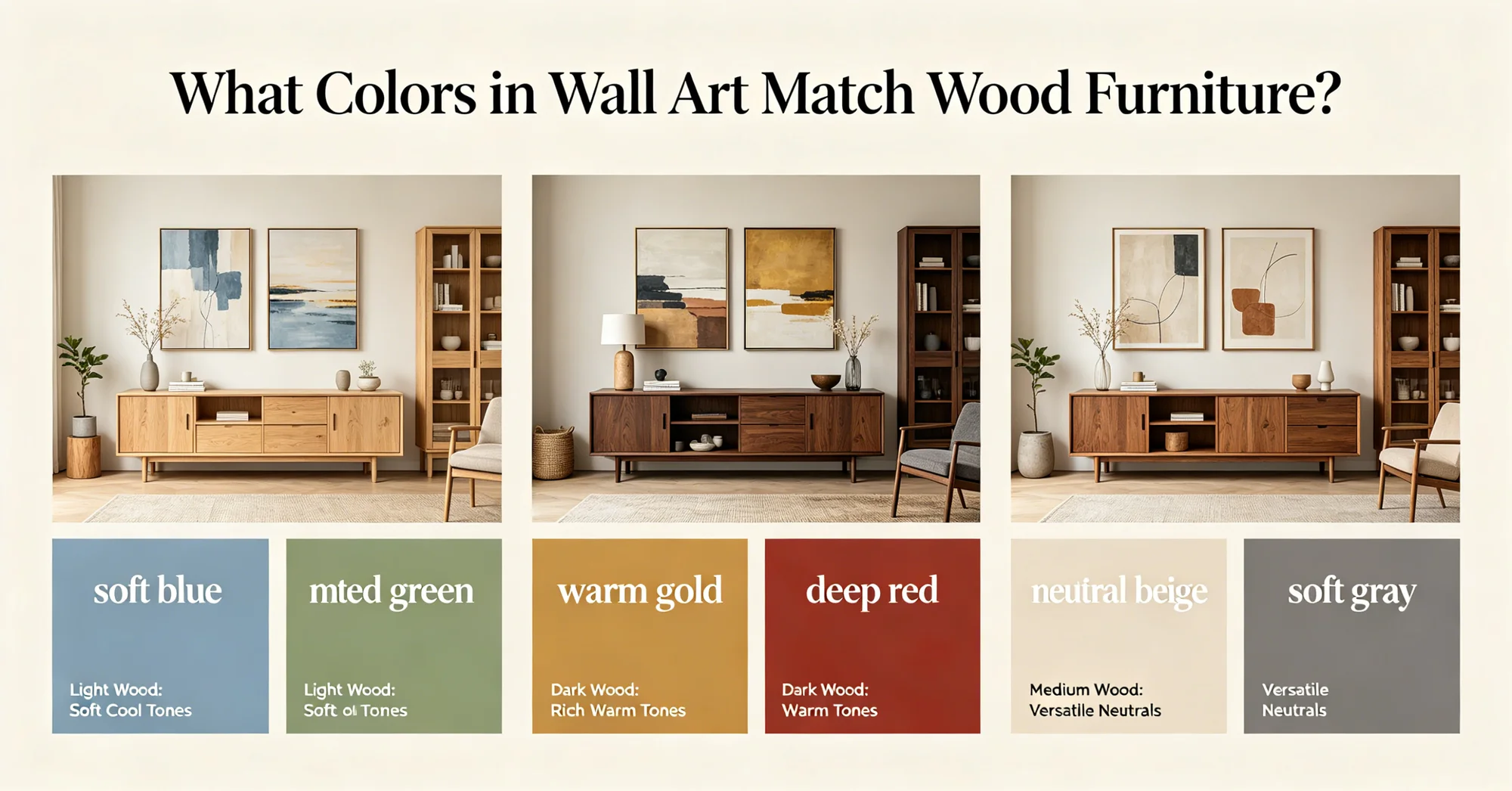
Cool colors—blue, green, violet—tend to recede, creating an illusion of greater distance. A 2025 study in the Journal of Environmental Psychology reported that participants perceived rooms with cool-toned wall art as 12% larger than identical rooms with warm-toned art. Warm hues (red, orange, yellow) advance, making walls feel closer. That doesn’t mean you should ban warm colors entirely: small hits of coral or ochre in an otherwise cool piece can add focus without shrinking the room. For US buyers, a 24×36 in (60×90 cm) abstract print with a pale blue background and a single warm accent line offers a balanced approach. UK and AU readers might prefer watercolor landscapes where cool greens dominate, but a warm frame (e.g., natural oak) provides contrast without overwhelming.
Sizing: scale matters more than you think
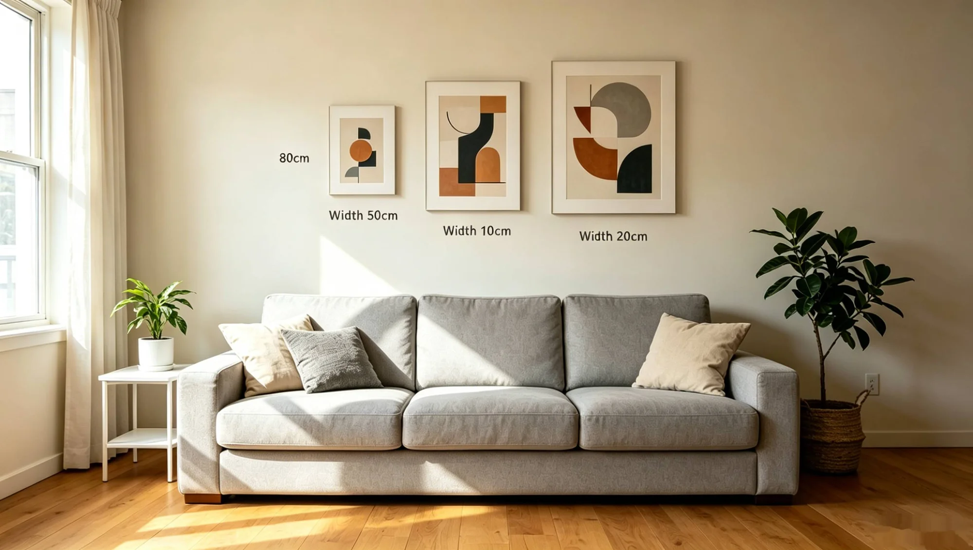
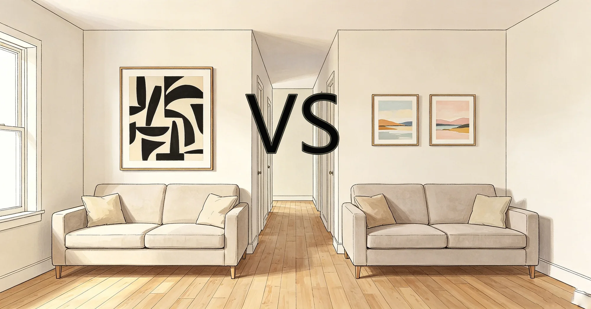
A common mistake is using small art in a small room. Industry data from a 2025 Artfinder retail report showed that prints under 16×20 in (40×50 cm) actually made rooms feel more cramped because they left too much negative wall space. Optimal sizing for a standard 10×12 ft (3×4.6 m) living room is a single piece between 30×40 in (76×102 cm) and 40×60 in (102×152 cm). For UK buyers with narrower walls (often 3 m wide in Victorian terraces), a vertical 24×36 in (60×90 cm) piece works better. Australians in modern apartments with open-plan layouts can go larger—up to 48×72 in (120×180 cm)—provided the art is lightweight and framed without glass to reduce weight.
Neutral abstracts: the safe bet for renters
Renter-friendly wall decor needs to be easy to hang, easy to remove, and unlikely to clash with existing landlord paint. Neutral abstract wall art—think beige, stone, taupe, or pale gray—covers all bases. A 2025 survey by the National Association of Realtors found that 68% of renters in the US prefer art that doesn’t require wall repair, and neutral tones are the most versatile across different paint colors. Brands like Desenio, Minted, and auraveli offer canvas prints and framed prints in this palette. auraveli, for instance, produces oversized neutral abstracts on gallery-wrapped canvas with a matte finish, which reduces glare and suits rooms with east or west exposure. At roughly $85 to $150 (£65–£120, A$130–$230), these sit between budget open-edition prints and custom-framed originals. The absence of bold hues also means they’re less likely to be rejected by landlords during inspections.
Frames that move with you
Frame color and material affect both perception and portability. White or light wood frames (pine, ash) blend with walls and feel less bulky, while dark frames (black, walnut) create a frame-within-room contrast that can make a small space feel more defined but also heavier. A 2025 report from the UK’s Trade Association for Framing noted that 54% of small-flat dwellers chose white frames for rented homes. For renters in all three countries, clip frames or floating frames without backing boards are lighter and easier to transport.75 in (1.9 cm) profile in white or natural oak, which keeps the visual weight low. As interior designer Julia Miller of London put it: “In a small living room, the frame should disappear, not compete.” That principle applies whether you’re in a Manhattan studio, a Glasgow tenement, or a Brisbane unit.
Mirroring the light: metallic and glossy finishes
High-gloss finishes can bounce light and add a sense of depth, but they also catch reflections and may distract in rooms with variable lighting. A 2026 trend report by Pinterest Predicts noted a 40% increase in searches for “metallic accent wall art” among US users, while UK and AU searches focused more on “brushed gold” and “soft copper” frames. If your living room gets strong afternoon sun, a glossy print on acrylic or metal might create glare spots. For AU buyers, where UV exposure is higher, UV-protective glazing is worth the premium—typically A$30–$50 extra.
The one-accent rule: using color intentionally
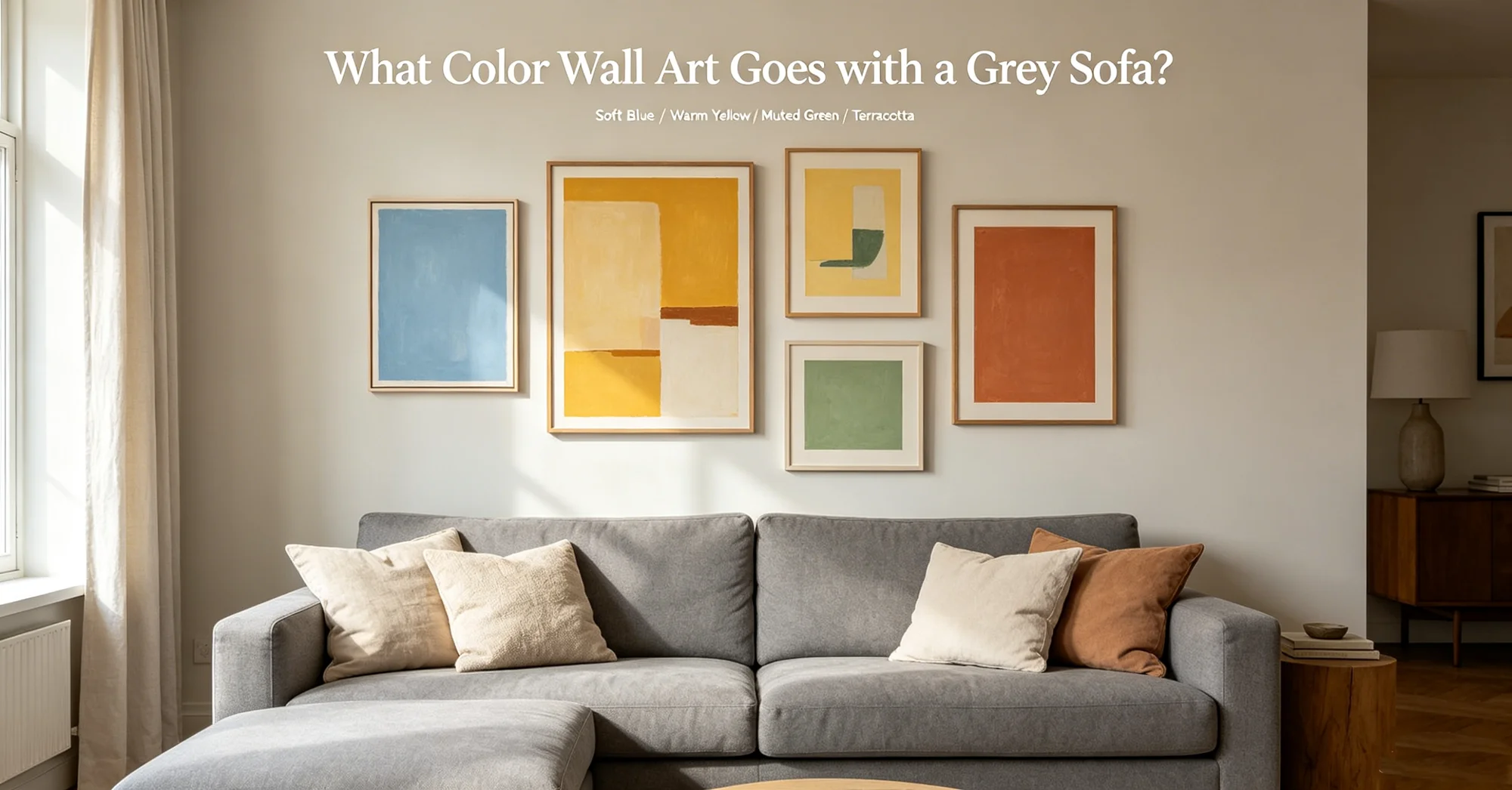
Instead of filling a wall with multiple vibrant pieces, pick one accent color and repeat it in the art and the room’s soft furnishings. For example, a pale gray canvas with a single stripe of muted teal can be echoed in a throw pillow or rug. A 2025 study by the Colour Group (GB) found that rooms with a single accent color in wall art and textiles were rated as 18% more spacious than those with clashing or unrelated colors. US and UK buyers can test this with inexpensive poster prints before committing to a larger piece. Australians might consider outdoor-indoor flow: if your living room opens to a garden, use a green accent that connects interior and exterior visually.
Hanging height and arrangement
Even the best color choice fails if the art is hung wrong. Standard gallery height—57 to 60 in (145 to 152 cm) from floor to center of the piece—works for most adults, but in small rooms with low furniture, you may need to lower it by 2–3 in (5–8 cm). A 2025 report from the Australian Interior Design Awards recommended that in rooms under 15 m², the bottom of the art should sit 6–8 in (15–20 cm) above the sofa back to avoid a cramped feeling. For US renters using command strips, ensure the wall is clean and the strip weight rating exceeds the art weight by 20%. UK landlords often prohibit nails in listed buildings; removable adhesive hooks rated for 5 kg (11 lb) are a safer alternative. In all three markets, grouping multiple small pieces in a cluster (rather than spreading them out) creates a larger visual block that tricks the eye into seeing a bigger wall.
Seasonal and trend-based color shifts
Color preferences for small living rooms change with seasons and broader design cycles. A 2025 report by the British Design Council found that 43% of UK homeowners swap wall art seasonally, with lighter tones (pale lemon, soft mint) preferred in spring and deeper neutrals (charcoal, slate) in winter. In the US, a 2026 trend forecast by Modsy predicted a rise in “warm minimalism” for small spaces—think oatmeal, blush, and clay tones—which pair well with natural wood frames. Australian buyers, facing opposite seasons, often opt for “coastal cool” palettes (pale aqua, sandy beige) year-round, as these suit both summer heat and mild winters. When selecting art, consider whether you plan to rotate pieces: if so, a neutral base with interchangeable accent prints offers flexibility without repainting walls.
Price bands and material trade-offs
Budget affects color options indirectly through material quality. A 2025 retail analysis by Statista showed that canvas prints priced under $50 (£38, A$75) often use thin 0.75 in (1.9 cm) stretcher bars and low-grade inks that fade within two years in direct sunlight. Mid-range pieces ($85–$150 / £65–£120 / A$130–$230) typically use gallery-wrapped canvas with UV-resistant coatings, preserving color vibrancy for five to seven years. At the top end ($250+ / £200+ / A$380+), you get archival paper, hand-finished frames, and custom color matching—useful if you need a precise hue to complement a specific wall color. In our experience, paying extra for fade-resistant inks is worthwhile if the art faces a window, especially in Australia’s high-UV climate.