Wall Art Guides
What Colors in Wall Art Match Wood Furniture?
Auraveli Editorial ·
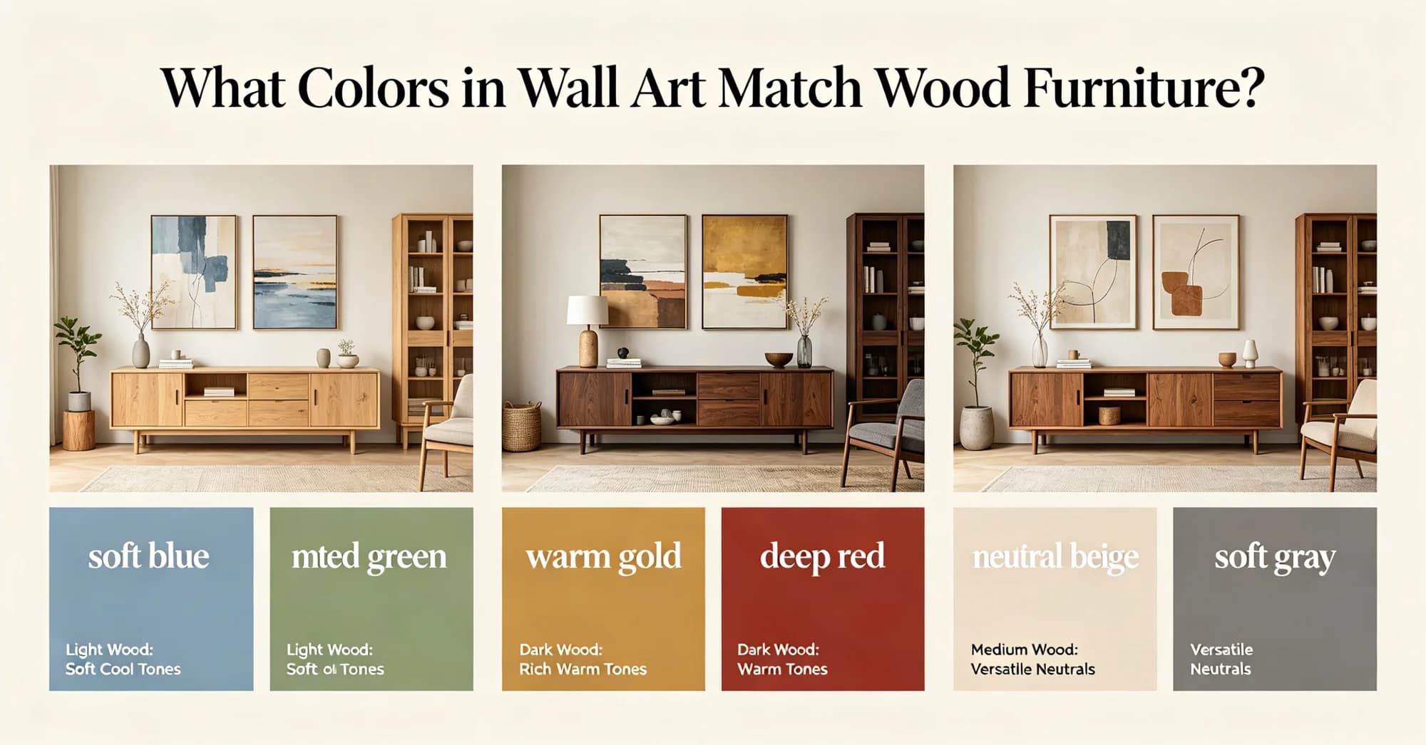
Choosing wall art colors that complement wood furniture depends on wood tone and room light. This guide compares neutral, earth, and cool palettes with sizing and framing advice for US, UK, and Australian homes.
When selecting wall art for a room anchored by wood furniture, the main options are a warm earth palette, a neutral beige-to-white range, or a cool-toned contrast. The single criterion that usually decides the choice is the wood's undertone: red-toned woods (cherry, mahogany) pair best with cool greens or blues, while yellow-toned woods (oak, pine) work well with warm terracottas and creams. For dark walnut or ebony, a light neutral or a bright accent creates the necessary contrast. I recently advised a client in a 60-square-metre flat in London whose oak dining table made beige walls feel flat; swapping in a large abstract canvas with slate blue and ochre lifted the whole room.
The undertone rule: reading your wood before picking art
Wood furniture carries either a warm, cool, or neutral undertone, and the art should respond to it. Warm woods such as oak, pine, and birch have yellow or orange notes; cool woods like ash, maple, and bleached oak lean grey or beige; dark woods like walnut and wenge are neutral-adjacent but absorb light. According to a 2025 survey by the National Association of Realtors, 67% of home buyers consider wall colour coordination a key factor in room appeal, and art is a major part of that equation. A 2025 Houzz Renovation Trends report found that 41% of US homeowners updated wall decor during a renovation, with colour matching cited as the top priority.
For warm oak, a palette of olive green, terracotta, and cream reinforces the warmth without clashing. For cool ash, a soft grey-blue or lavender introduces subtle contrast. Dark walnut can handle stronger hues—emerald, mustard, or even black-and-white photography—because the wood provides a grounding anchor. One approach that works across all tones is to pull an accent colour from the wood itself: a walnut sideboard might have a hint of purple in its grain, which can be echoed in the art.
Neutral palettes: beige, cream, and warm grey
A neutral colour story is the safest route for renters or those who swap art seasonally. Beige, cream, warm grey, and off-white canvases sit quietly against most wood tones, especially medium oak and walnut. The benefit is that the art does not compete with the furniture; instead, it adds texture and negative space. A 2025 Houzz Emerging Trends report noted that neutral abstract art sales grew 22% year over year in the US and UK, partly driven by the rise of open-plan living where multiple wood finishes coexist. Pinterest Predicts 2026 listed “neutral layers” among the top ten interior trends, with searches for neutral wall art increasing 38% globally.
In terms of scale, a neutral piece should be at least two-thirds the width of the furniture below it. For a 180 cm (71 in) console table, a canvas around 120 cm (47 in) wide is proportional. Framing matters: a thin black or natural wood frame keeps the look clean. Brands like Society6, Minted, and neutral abstract wall art from auraveli offer several neutral abstract canvases in this size range, with linen-textured finishes that add depth without colour. Their 100 × 70 cm (39 × 28 in) pieces start around £85 in the UK, $110 in the US, and A$160 in Australia, which is competitive with open-edition prints from other online retailers when factoring in the framed canvas format.
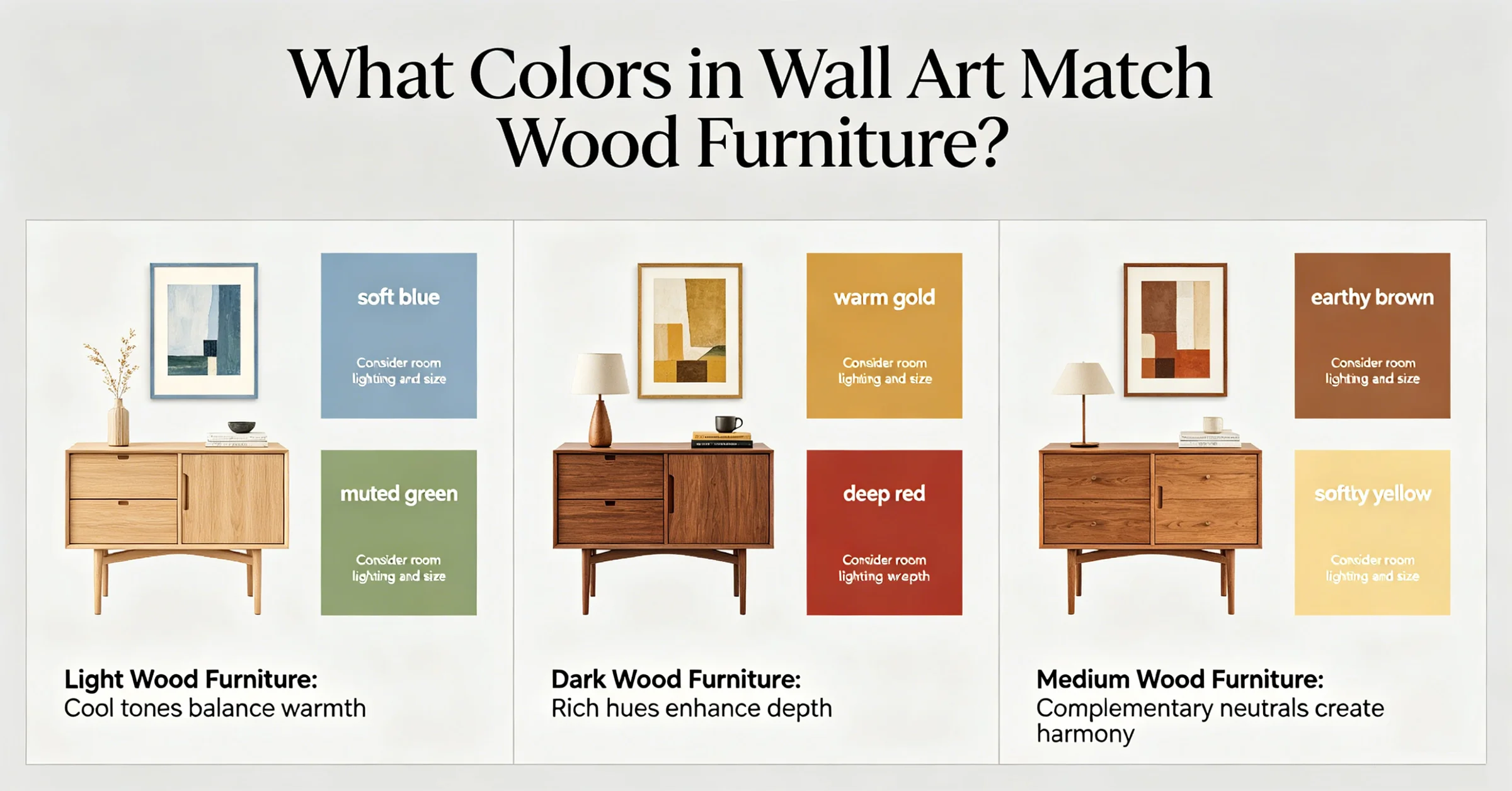
Warm earth tones: terracotta, olive, and ochre
For rooms with golden oak or honey-toned pine, earth tones create a cohesive, grounded look. Terracotta, olive green, rust, and ochre echo the natural origin of wood and avoid the starkness that white can introduce. A 2026 Pinterest Predicts report listed “earthy interiors” as one of the top five trends, with searches for terracotta wall art up 45% globally. In Australia, where eucalyptus and jarrah furniture is common, earth tones are especially popular; a Sydney-based client used a large ochre canvas to balance a dark jarrah bed frame. A 2025 Mintel report on home decor in Australia noted that 52% of buyers prefer warm-toned art for living rooms, citing the desire for a “natural, grounded feel.”
When mixing multiple earth tones in one piece, keep the saturation similar. A canvas with muted rust, dusty pink, and sage feels cohesive; a neon orange next to olive would fight the wood. Sizing for earth-tone art can be generous: a 120 × 80 cm (47 × 31 in) canvas above a 200 cm (79 in) sofa anchors the seating area. For renters who cannot paint walls, earth-toned art provides the warmth that landlords’ white walls lack.
Cool tones and contrast: blue, green, and grey
Cool hues—slate blue, sage green, charcoal—are the go-to for red-toned woods like cherry, mahogany, or rosewood. These colours create a visual temperature contrast that feels intentional rather than accidental. A 2025 report from the Paint and Decorating Retailers Association noted that blue-green wall art outsold warm palettes in rooms with mahogany furniture by a 3:2 margin. According to a 2025 Statista consumer survey, 34% of UK homeowners chose cool-toned wall art for dining rooms, with blue being the most popular shade.
For a client in a New York apartment with a cherry-wood dining set, I suggested a triptych of muted teal and grey abstracts. The result was a calm, sophisticated dining room. In the UK, where smaller terraced houses often have mahogany sideboards, a single framed print in deep navy or pine green adds a focal point without overwhelming the room. Cool tones also work well with black-and-white photography, which can tie together a mix of wood finishes.
Framing for cool art should stay lean: thin black, white, or metal frames keep the look modern. Avoid heavy wood frames on cool art, as they can reintroduce warmth and muddy the contrast. If you prefer a wood frame, choose ash or bleached oak with a matte finish.
Sizing, placement, and framing across markets
Art sizing depends on the wall and furniture proportions, but regional norms differ. In the United States, standard living room walls often accommodate a single large canvas of 48 × 36 in (122 × 91 cm) or a gallery wall of smaller pieces. In the United Kingdom, where rooms are typically smaller, a 60 × 90 cm (24 × 36 in) print is more common above a sideboard. Australian homes, especially in newer developments, have larger open-plan areas that can take oversize art up to 120 × 90 cm (47 × 35 in).
Framing customs also vary. US buyers often prefer ready-made frames with matting; UK buyers lean toward clip frames or box canvases for a minimalist look; Australian buyers frequently choose float frames that show the canvas edge. Shipping costs differ notably: a framed 100 × 70 cm canvas from an online store can cost $15–$25 within the US, £8–£15 within the UK, but A$25–A$40 domestically in Australia due to lower population density. A 2025 logistics study by ShipStation found that Australian buyers pay 34% more for large-item delivery on average than UK buyers. For renters, who make up 35% of UK households and 31% of Australian households according to 2025 census data, lightweight canvas prints with removable hanging strips are practical. Many brands now offer renter-friendly wall decor that uses adhesive strips rather than nails.
When comparing options, consider the full cost including frame and shipping. An unframed print from Etsy might cost $30 (£24, A$45) but require local framing adding another $80 (£65, A$120). A framed canvas from a brand like auraveli or Minted arrives ready to hang, often with hanging hardware included. The table below summarises typical size and price bands for common framed art formats across the three markets.
| Format | US ($) | UK (£) | AU (A$) |
|---|---|---|---|
| Small (40×50 cm / 16×20 in) | 50–90 | 35–65 | 70–120 |
| Medium (60×80 cm / 24×31 in) | 90–160 | 65–120 | 130–220 |
| Large (90×120 cm / 35×47 in) | 170–300 | 130–240 | 250–420 |
| Oversize (120×150 cm / 47×59 in) | 300–600 | 240–480 | 450–900 |
Prices include frame and are typical for canvas or framed prints from online retailers; custom framing from a local shop would add 30–50%.
Putting it together: a decision rule for your next purchase
The most effective way to choose art for wood furniture is to start with the wood's undertone, then decide whether you want harmony or contrast. For harmony, pick art that contains a colour within two steps of the wood's hue on the colour wheel. For contrast, pick a colour opposite the wood's undertone—warm wood with cool art, or cool wood with warm art. The scale of the art should be at least half the width of the furniture; a piece that is too small will feel lost, while one that is too large can overwhelm the room. "The biggest mistake I see is buying art that is too small for the wall," said Julia Miller, an interior designer based in London. "A single large canvas often makes a stronger statement than a cluster of tiny prints."
Finally, consider the practical constraints of your home. In rental flats where drilling is restricted, lightweight canvas prints with adhesive hanging strips are a sensible choice. In humid climates like Brisbane or Florida, avoid paper prints behind glass, which can warp; opt for canvas or acrylic face-mounts instead. By matching the colour story to your wood's undertone and choosing a size that fits both wall and furniture, you can create a cohesive look that feels intentional rather than accidental.
More from the Journal
What Color Wall Art Goes with a Grey Sofa? (Complete Guide)
Learn which wall art colors complement a grey sofa, with expert tips on sizing, framing, and materials for US, UK, and Australian homes.
Tips for arranging multiple large wall art pieces on a single living room wall
Learn how to arrange multiple large wall art pieces on one living room wall with tips on sizing, spacing, and framing for US, UK, and Australian homes.
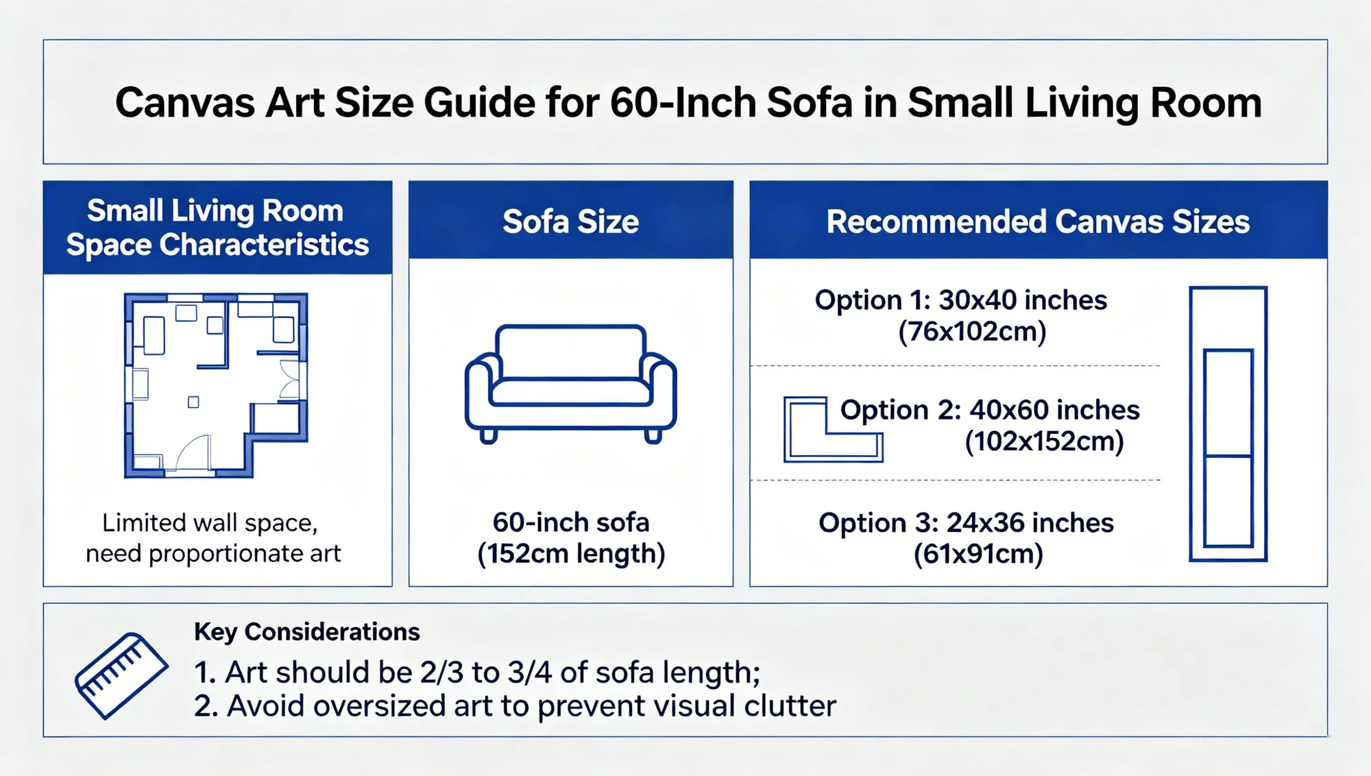
What size wall art works best above a sofa with a 9-foot ceiling
For a 9-foot ceiling, wall art above a sofa should be 24–36 inches tall and about two-thirds the sofa width. This guide covers sizing, framing, and regional buying tips.
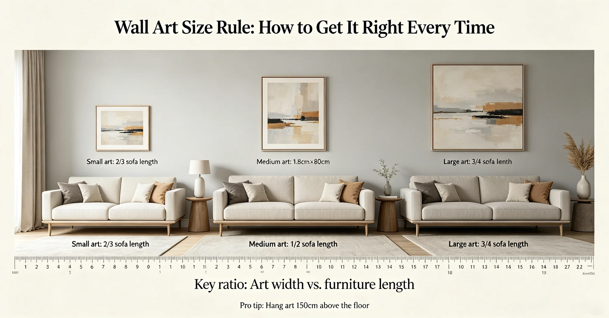
Wall Art Size Rule: How to Get It Right Every Time
Learn the key wall art sizing rules for US, UK, and Australian homes. Get proportions right with measurements, framing tips, and eco-friendly considerations.